Different briefs.
A considered response.
Eight selected projects across mobile apps, commerce and dashboards. Explore the screens and the design decisions behind them.
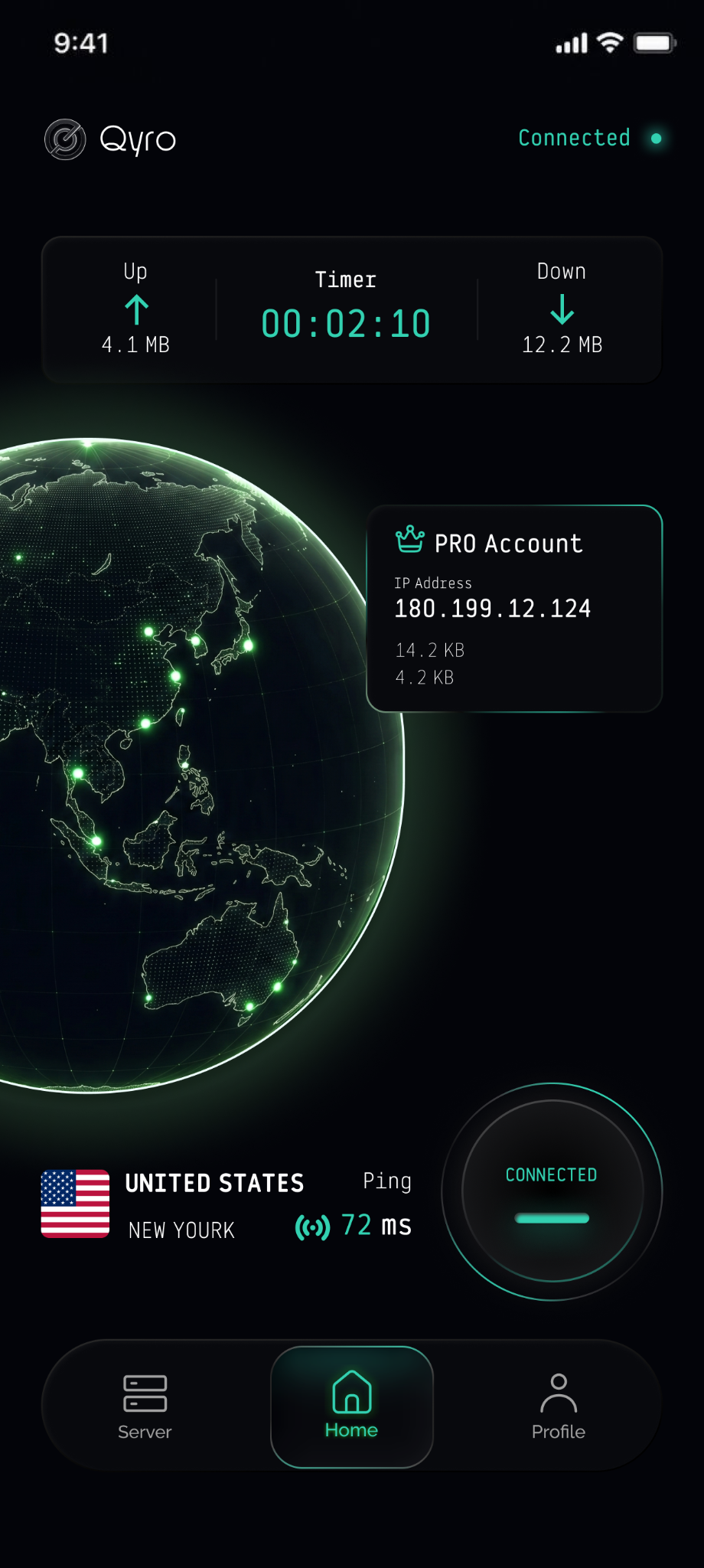
Qyro
A dark interface for a VPN app, with luminous accents and a globe-led home screen.
View the design gallery ↗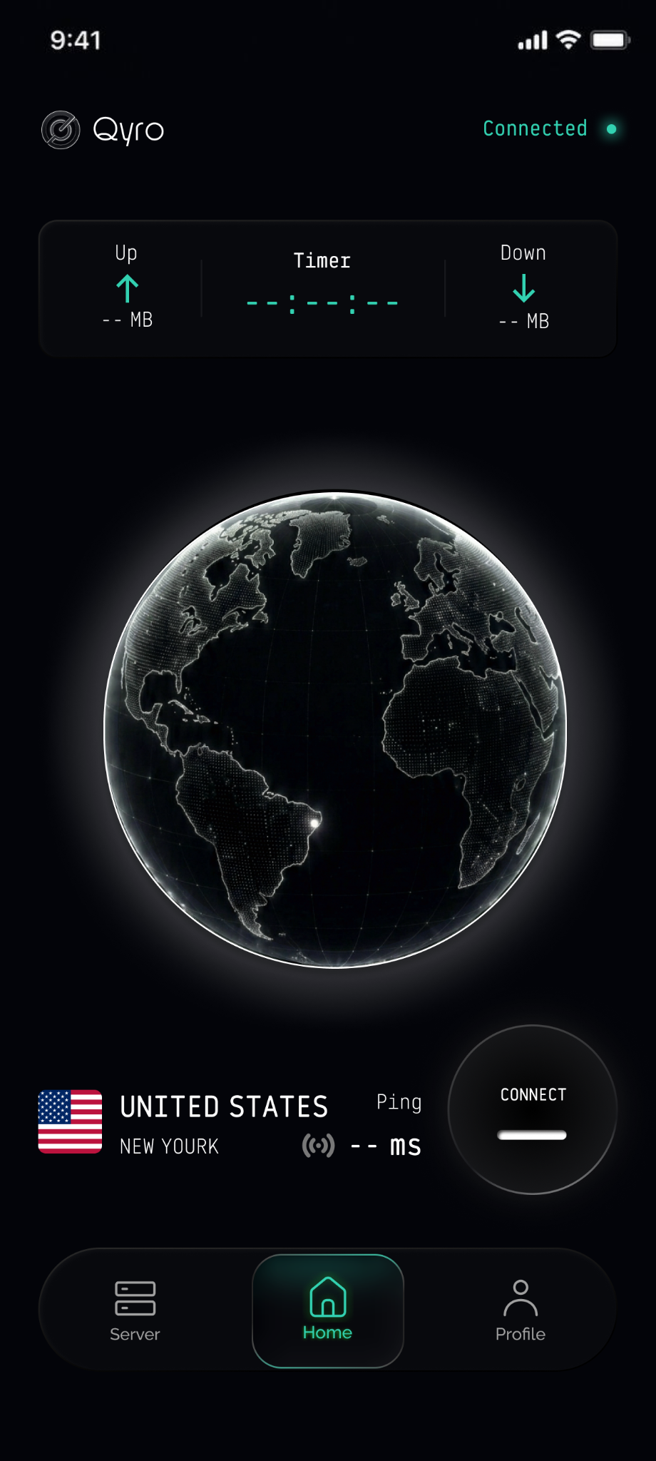
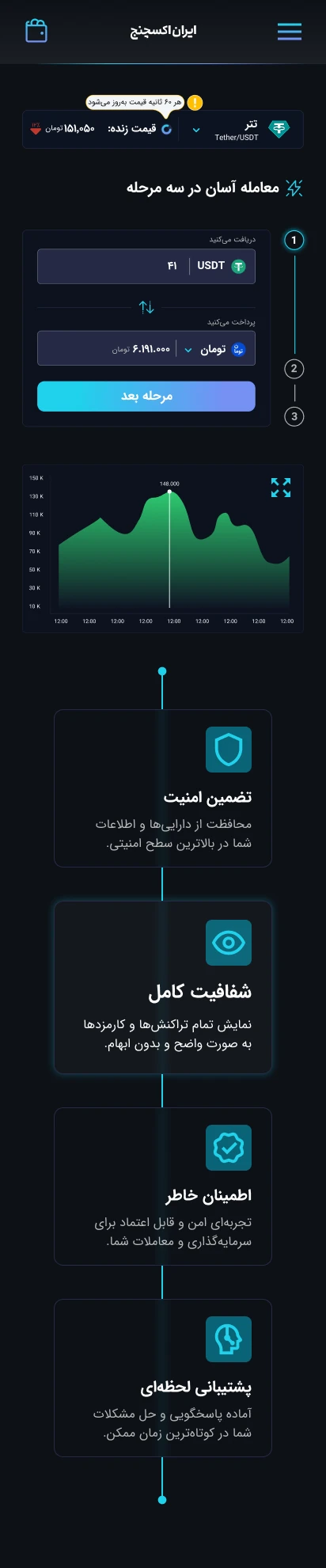
A clearer path
to buying USDT.
A focused purchase journey, designed across mobile and desktop in light and dark themes.
View the design gallery ↗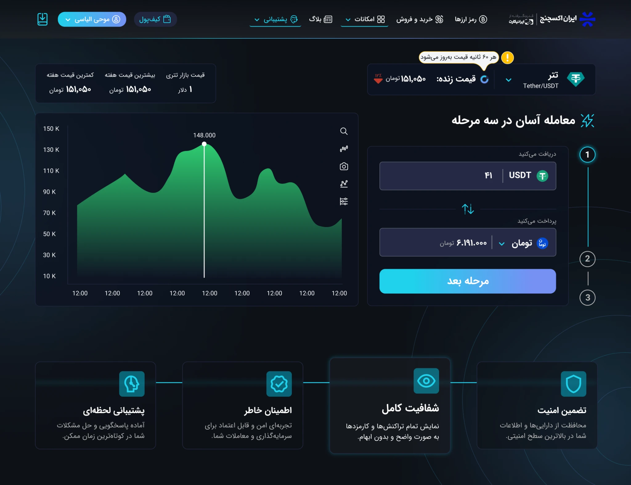
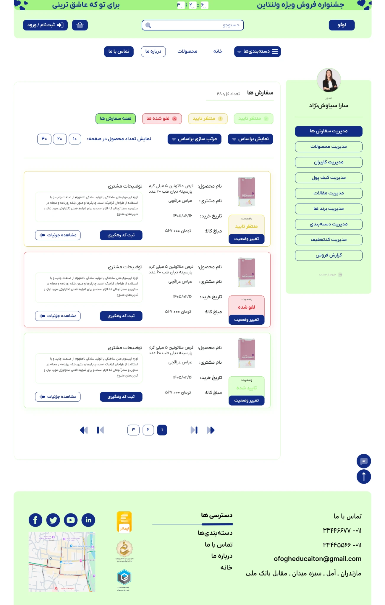
One pharmacy.
Two perspectives.
A public storefront and internal tools, with distinct palettes shaped around the client’s chosen direction.
View the design gallery ↗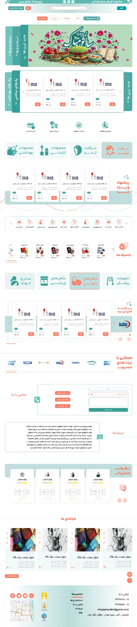
A big catalog.
A clearer beginning.
Category entry points and mobile shopping screens for a store with an extensive product range.
View the design gallery ↗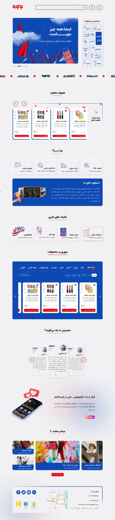

Building materials,
two visual directions.
My initial homepage concept and the client-selected direction, followed through to product browsing and order inquiries.
View the design gallery ↗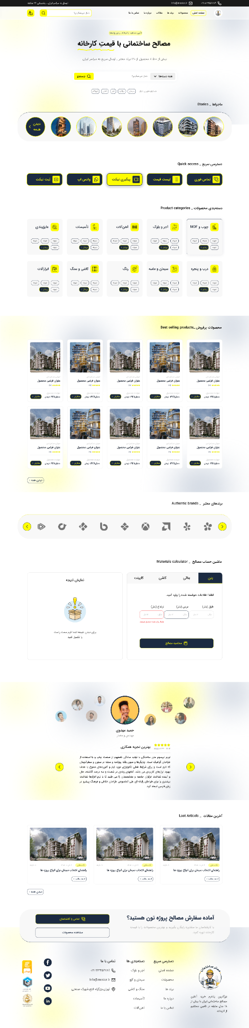
A fresh look.
A stronger hierarchy.
A redesigned storefront brings categories, product groups and promotions into a more deliberate order.
View the design gallery ↗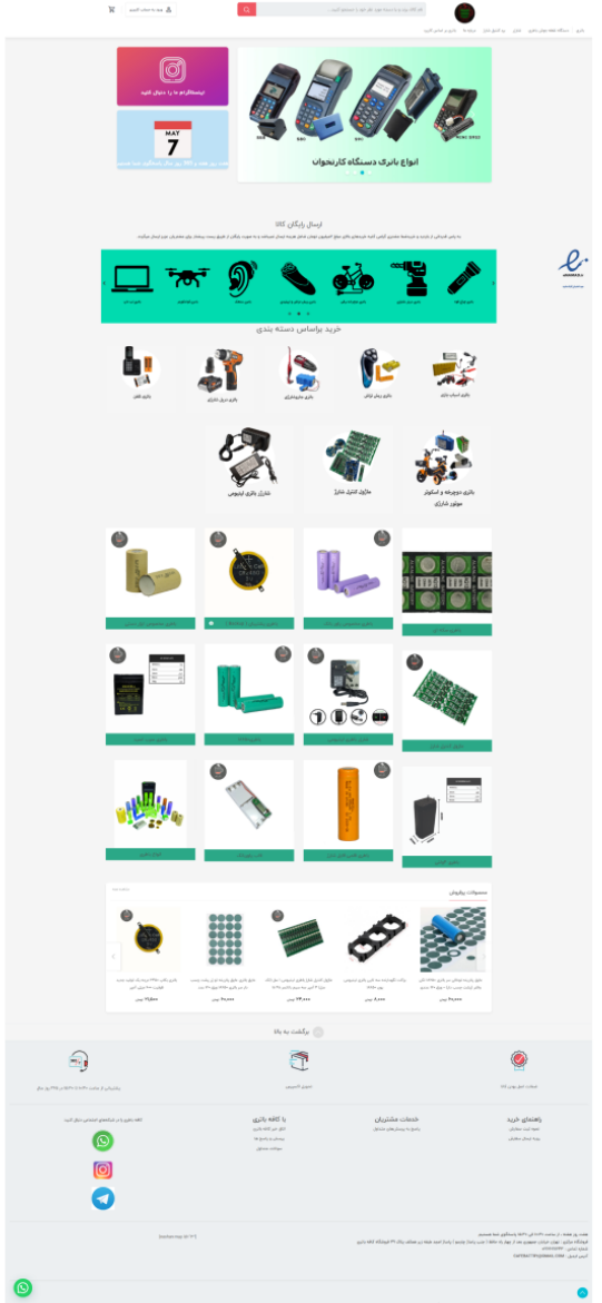
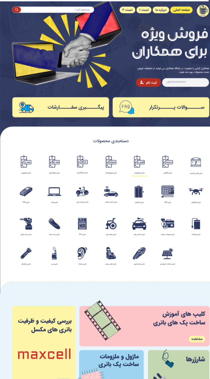
Made to give.
Designed to stand out.
Bold outlines, playful color and graphic categories create a distinctive storefront for gifting.
View the design gallery ↗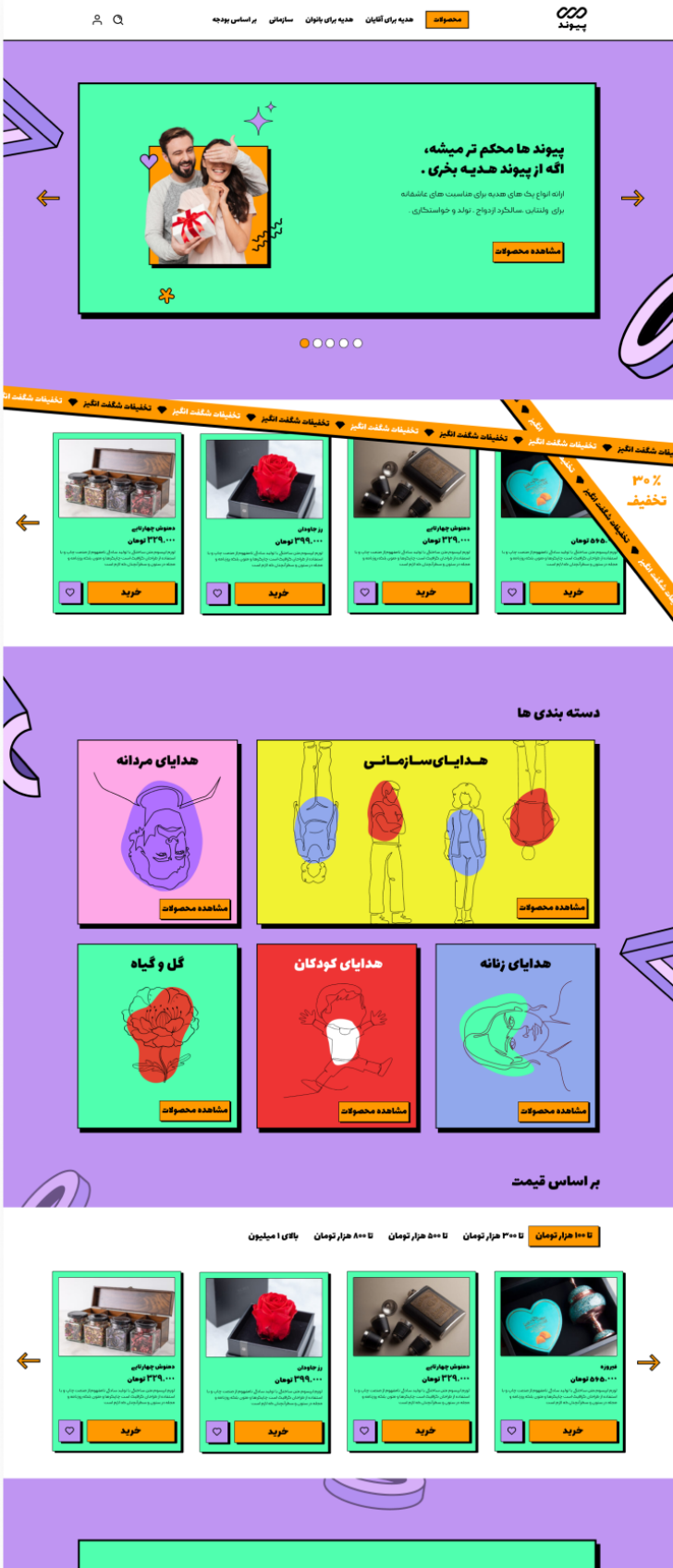
A warmer welcome
for little companions.
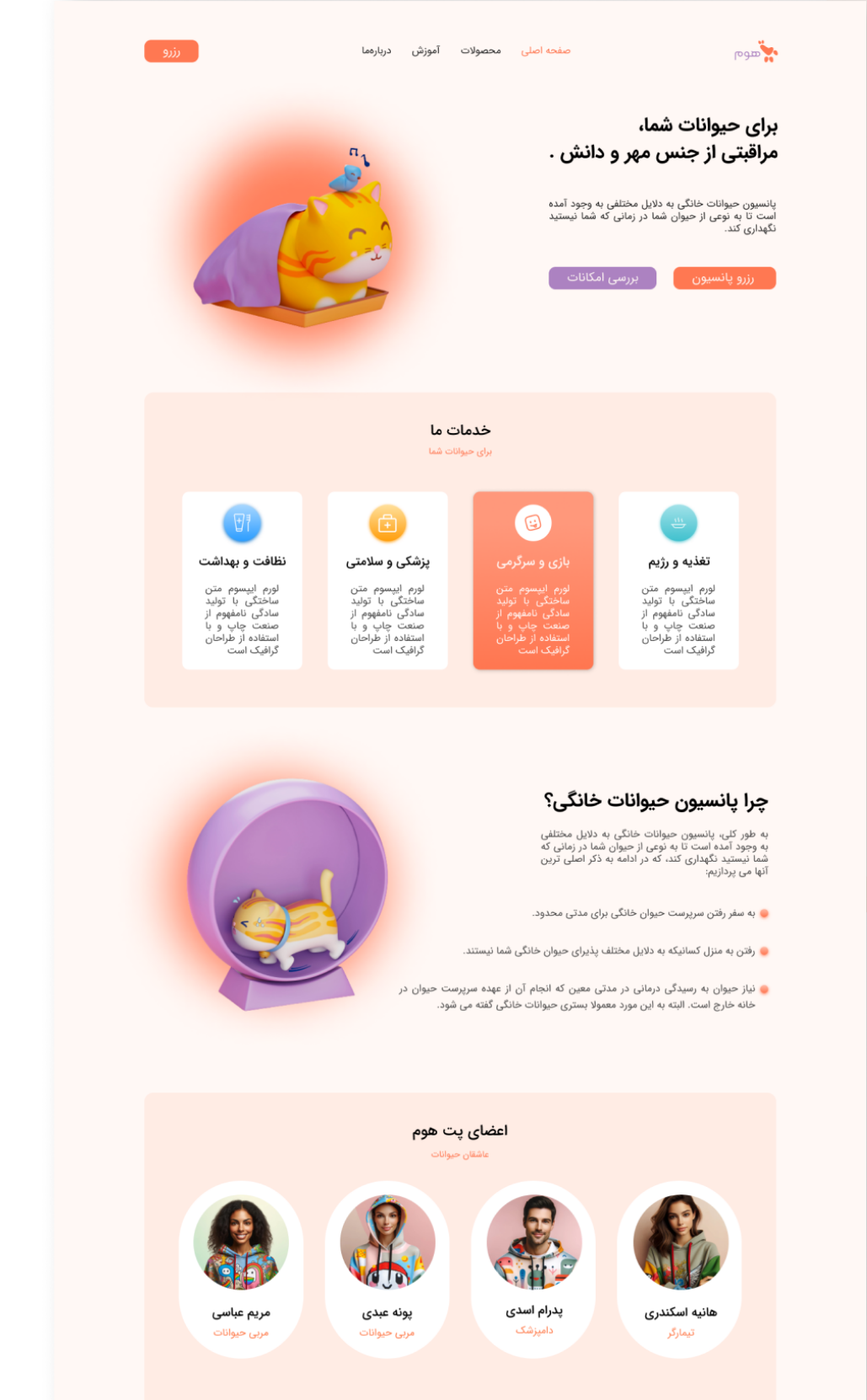
Soft colors and playful illustrations introduce pet boarding, care services and the people behind them.
View the design gallery ↗